It’s here! It’s here! It’s here!
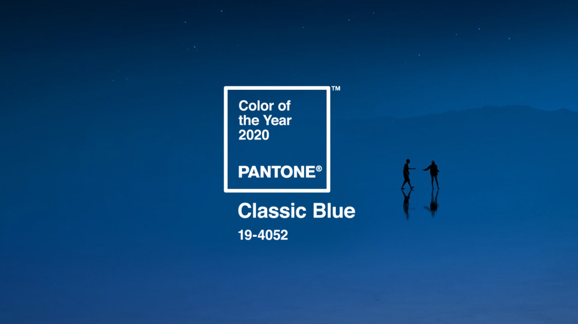
The 2020 Pantone Color of the Year has been announced: PANTONE 19-4052 Classic Blue.
If your interests include fashion, design, advertising, the arts or any other kind of creative passion, you are probably familiar with Pantone. In a nutshell, they provide a unique language of color that allows a variety of industries to plan, collaborate, design and execute color-critical decisions, and while the word “pantone” or “PMS color” (short for pantone matching system) is frequently associated in our world of print, there are millions of people across the globe that utilize the intricate system of the Pantone Color Institute. Pantone has only been around since its establishment in 1963 and incorporated the PCI in 1986. The very first color of the year, Cerulean, was released in 1999 and has been infiltrating the design world ever since.
The color of the year is chosen after carefully observing industry trends from around the world and influences are pulled from almost everywhere. From the entertainment industry to films, traveling to art collections and fashion, all areas of design, popular travel destinations- the inspiration is truly endless. Even locally, we have seen how a simple color choice can impact brands differently and separate them from their competition. Color choices also play a dynamic role in driving consumer engagement and keeping brand standards locked in. The Pantone Matching System provides accuracy, quality and consistency of color printing every time, enabling creative teams to express themselves and businesses to build a strong and highly recognizable brand.
Some tidbits about 2020’s color:
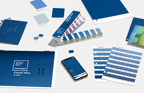
- PANTONE 19-4052 Classic Blue’s translation to an ink color for printing is PANTONE 2154 C
- PANTONE had a little help with the big reveal
- One of the reasons it was chosen: Classic Blue is the color of the sky at dusk which is a strong visual symbol about fresh starts. Since it’s the sky, it’s also a color of blue everyone sees everywhere around the world—a universal color that transcends global cultures.
- There is a pop culture reference to Kanye West’s album cover “Jesus is King” in reference the blue color used in the artwork and what it means
- A few words used to describe Classic Blue: timeless, simplistic, universal, trust, confidence, anchor, expand, challenge
- Sherwin Williams’s 2020 Color of the Year is also a blue called “Naval”
- Both Naval and Classic Blue are meant to play on another big trend: wellness
Here’s what Pantone had to say about the 2020 choice:
“We are living in a time that requires trust and faith. It is this kind of constancy and confidence that is expressed by PANTONE 19-4052 Classic Blue, a solid and dependable blue hue we can always rely on. Imbued with a deep resonance, Class Blue provides and anchoring foundation. A boundless blue evocative of the vast and infinite evening sky, Classic Blue encourages us to look beyond the obvious and expand our thinking; challenging us to think more deeply, increase our perspective and open the flow of communication.”
– Leatrice Eiseman, Executive Director of The Pantone Color Institute